Here's Why the Nothing Phone (3)'s Divisive Design Is Good, Actually

When Nothing launched its first phone in 2022, with its stripped-down, transparent aesthetic, it was a big, bold design statement: When you see the Nothing Phone (1) in the street, you won't mistake it for any other smartphone.
But the impulse to stand out inevitably meets push-back. Sooner or later, bold design choices will divide your early supporters. That's where we are with the Nothing Phone (3). This is Nothing's first "true flagship," so says CEO Carl Pei, and it's their most controversial device yet. The new look has left members of the /NothingTech subreddit scratching their heads (to put it mildly).
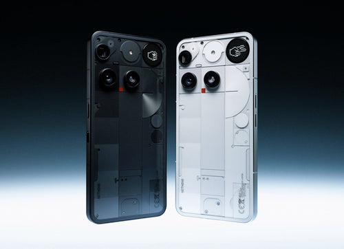
At first glance, it's easy to see why. The triple camera setup isn't aligned. The new dot-matrix Glyph looks more a gimmick than a game-changer. And those much-adored Glyph lights of previous Nothing Phones are gone. Even Mrwhosetheboss, a longtime supporter of Nothing, opened his review with visible disappointment: "This is the first Nothing phone I've seen that hasn't instantly vibed with me."
And yet...
After sitting with the design for a while, it starts to makes sense. The Nothing Phone (3) isn't a misfire but a huge step forward for the brand and smartphone design at large.
Nothing Phone (3)'s Glyph Matrix: See how deep the rabbit hole goes
Start with the Glyph. On the Phone (1) and (2), Nothing's rear LED strips offered an eye-catching but mostly aesthetic experience. They blinked with incoming calls or synced with ringtones, but never felt like more than a "nice to have" for me.
The Nothing Phone (3), on the other hand, replaces those lights with the Glyph Matrix. It's more subdued, yes. Is it more useful? Yes, again! The Glyph Matrix is a tiny, dot-matrix display of 489 LEDs showing real-time info like battery level, timers, and notifications. Plus, there are the mini tools, like the Magic 8 Ball, compass, and a spirit level if you're into DIY.
But what the Glyph Matrix can do now isn't the end of the story. What excites me is the philosophy behind it and, more specifically, what the future holds for this nifty piece of hardware real estate. Nothing is inviting developers to create use-cases for the Glyph Matrix, opening up the backend, so others innovate for things that Nothing itself hasn't yet imagined.
That's a massive shift in smartphone design.
Still not persuaded? Think back to the launch of the first iPhone 18 years ago (if you're old enough). Back then, the iPhone was groundbreaking in design but had limited features. Like previous phones, you could make calls, browse the web, and take photos, but not much else. Things didn't take off until third-party developers entered the fray and built the killer apps that made the iPhone iconic and universal in its appeal. The App Store, launched a year later, established the iPhone as a foundation of modern mobile computing.
The Glyph Matrix isn't on that level (yet), but the philosophy is the same: a platform is only as powerful as what people build on top of it.
So, what might developers dream up? Quick-glance directions for navigating a new city? Health stats? QR code displays? We'll see.
Whether or not the Glyph Matrix becomes a permanent design fixture in Nothing's future lineup, this kind of design democratization—letting the community shape what a feature becomes—is unprecedented in mobile hardware. Even without the lights, the future is bright for the Glyph Matrix.

Nothing Phone (3)'s camera array: Imperfect is intentional
I'm a symmetry purist. When I first saw the Nothing Phone (3)'s design leaks, I had to double-take. And then I got out a ruler and put it on my screen to be sure. Next, I felt a strange urge to nudge that top camera into place with my finger.
Now, I'm at the acceptance stage for this oddly spaced camera array. But the million-dollar question remains: Why?
My hunch is that it's arranged around the engineering realities of housing a periscope lens. These lenses use mirrors to fold light internally, typically requiring more space than traditional camera modules. That extra depth (combined with the need to make room for the new Glyph Matrix display) means the camera sensors had to be placed where they work, not where they might look symmetrical.
In that context, the layout feels like a calculated compromise that pays off. Nothing has delivered a kind of intentional imperfection or, better yet, purposeful asymmetry. It's functional and visually distinct. The transparent back panel underlines that feeling with its blocky, almost Bauhaus-inspired geometry of clean lines and layered planes. It's nothing new from Nothing: They've always designed devices that are a refreshing break from the inconspicuous minimalism of your average flagship.
That's what makes the Phone (3) feel both like a departure and a continuation of previous Nothing Phone generations. The asymmetrical camera layout and Glyph Matrix are steps into unknown territory. And these design risks remind me of what made me support Nothing in the first place.
You might love the design, hate it, or slowly come around. But one thing is clear: Nothing won't settle for playing it safe. And in 2025, that might just be the boldest design choice a phone company can make.

